> ## Documentation Index
> Fetch the complete documentation index at: https://docs.kubiya.ai/llms.txt
> Use this file to discover all available pages before exploring further.
# Analytics
> Centralized analytics for AEM, cost, runtime, and model efficiency with trends, summaries, and distribution views to track usage, optimize spend, and monitor organizational performance over time.
The **Analytics** page provides a centralized view of **Agentic Engineering Minutes (AEM)**, costs, and resource utilization across the organization.
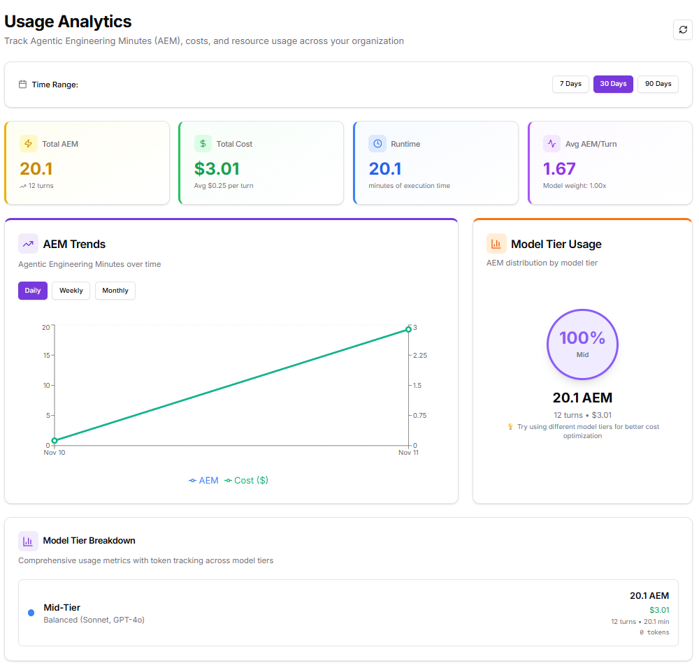 It helps track execution patterns, monitor model efficiency, and identify cost optimization opportunities.
The dashboard serves as a top-level summary for performance trends and usage behavior over a selected time period.
## **Key Sections**
### **1. Time Range**
Users can adjust the reporting window to view analytics over **7 days**, **30 days**, or **90 days**.
Selecting a different range automatically updates all metrics, charts, and summaries to reflect the chosen timeframe.
### **2. Metrics Summary**
This section displays four core metrics that provide a quick overview of organizational usage:
* **Total AEM** – Total Agentic Engineering Minutes consumed during the selected period.
* **Total Cost** – Total spend based on AEM usage, including the average cost per execution turn.
* **Runtime** – Cumulative execution time across all operations.
* **Average AEM per Turn** – Mean AEM utilization per turn, adjusted for model weighting.
These top-level indicators help assess productivity, performance, and cost efficiency at a glance.
### **3. AEM Trends**
The **AEM Trends** chart visualizes changes in usage and cost over time.
It provides options to view data **daily**, **weekly**, or **monthly**, making it easier to observe performance fluctuations and identify growth or efficiency patterns.
The graph plots:
* AEM usage (minutes of engineering time)
* Corresponding cost in dollars over the same timeline
This view helps correlate workload intensity with cost variation and evaluate how operational activity evolves over time.
### **4. Model Tier Usage**
This section summarizes AEM distribution by **model tier**, showing how different model categories contribute to total usage.
A circular chart presents the percentage of total AEM allocated to each model tier, helping teams understand where their compute resources are concentrated.
Example:
If all workload activity uses **Mid-Tier** models such as *Sonnet* or *GPT-4o*, the chart will display **100% Mid-Tier usage**, with a clear breakdown of AEM and total cost.
A short recommendation below the chart provides guidance for potential **cost optimization**, such as mixing model tiers based on task complexity.
### **5. Model Tier Breakdown**
This section provides a concise breakdown of metrics by model tier, summarizing execution details like total AEM, runtime, and cost.
It helps compare model performance characteristics and identify which tier offers the best balance of efficiency and cost.
Example:
A Mid-Tier model may show balanced results, moderate cost with steady runtime, indicating it is well suited for general-purpose workflows.
### **6. Quick Insights**
This section highlights key performance observations derived from current usage data.
It provides actionable summaries that help teams understand where optimizations can be made.
Key data points include:
* **Average Cost per Turn** – Displays the mean cost incurred per execution turn.
* **Most Used Tier** – Identifies the model tier with the highest AEM contribution.
* **Efficiency Rating** – Indicates the average AEM consumed per turn relative to model weight.
* **Optimization Opportunities** – Suggests adjusting model tiers based on task complexity to improve cost efficiency.
### **7. Explore More Analytics**
At the bottom of the page, users can navigate to other analytics modules for more detailed insights.
Each card redirects to a dedicated section that expands on specific aspects of usage and performance:
* **AEM Details** – Comprehensive breakdown of AEM trends, usage distribution, and efficiency metrics.
* **Usage Breakdown** – Analysis of runtime, turns, and overall resource consumption.
* **Custom Dashboards** – Tools to create personalized analytics views using key organizational metrics.
## **Purpose and Outcome**
The **Usage Analytics** dashboard provides an overview of operational performance and resource expenditure.
It allows users to:
* Monitor AEM usage and runtime efficiency across all workloads.
* Evaluate cost and performance trends over time.
* Identify which model tiers drive the majority of usage and spending.
* Access deeper analytics modules for custom or detailed exploration.
This page acts as the primary reporting interface for tracking system efficiency and supporting data-driven optimization within the organization.
It helps track execution patterns, monitor model efficiency, and identify cost optimization opportunities.
The dashboard serves as a top-level summary for performance trends and usage behavior over a selected time period.
## **Key Sections**
### **1. Time Range**
Users can adjust the reporting window to view analytics over **7 days**, **30 days**, or **90 days**.
Selecting a different range automatically updates all metrics, charts, and summaries to reflect the chosen timeframe.
### **2. Metrics Summary**
This section displays four core metrics that provide a quick overview of organizational usage:
* **Total AEM** – Total Agentic Engineering Minutes consumed during the selected period.
* **Total Cost** – Total spend based on AEM usage, including the average cost per execution turn.
* **Runtime** – Cumulative execution time across all operations.
* **Average AEM per Turn** – Mean AEM utilization per turn, adjusted for model weighting.
These top-level indicators help assess productivity, performance, and cost efficiency at a glance.
### **3. AEM Trends**
The **AEM Trends** chart visualizes changes in usage and cost over time.
It provides options to view data **daily**, **weekly**, or **monthly**, making it easier to observe performance fluctuations and identify growth or efficiency patterns.
The graph plots:
* AEM usage (minutes of engineering time)
* Corresponding cost in dollars over the same timeline
This view helps correlate workload intensity with cost variation and evaluate how operational activity evolves over time.
### **4. Model Tier Usage**
This section summarizes AEM distribution by **model tier**, showing how different model categories contribute to total usage.
A circular chart presents the percentage of total AEM allocated to each model tier, helping teams understand where their compute resources are concentrated.
Example:
If all workload activity uses **Mid-Tier** models such as *Sonnet* or *GPT-4o*, the chart will display **100% Mid-Tier usage**, with a clear breakdown of AEM and total cost.
A short recommendation below the chart provides guidance for potential **cost optimization**, such as mixing model tiers based on task complexity.
### **5. Model Tier Breakdown**
This section provides a concise breakdown of metrics by model tier, summarizing execution details like total AEM, runtime, and cost.
It helps compare model performance characteristics and identify which tier offers the best balance of efficiency and cost.
Example:
A Mid-Tier model may show balanced results, moderate cost with steady runtime, indicating it is well suited for general-purpose workflows.
### **6. Quick Insights**
This section highlights key performance observations derived from current usage data.
It provides actionable summaries that help teams understand where optimizations can be made.
Key data points include:
* **Average Cost per Turn** – Displays the mean cost incurred per execution turn.
* **Most Used Tier** – Identifies the model tier with the highest AEM contribution.
* **Efficiency Rating** – Indicates the average AEM consumed per turn relative to model weight.
* **Optimization Opportunities** – Suggests adjusting model tiers based on task complexity to improve cost efficiency.
### **7. Explore More Analytics**
At the bottom of the page, users can navigate to other analytics modules for more detailed insights.
Each card redirects to a dedicated section that expands on specific aspects of usage and performance:
* **AEM Details** – Comprehensive breakdown of AEM trends, usage distribution, and efficiency metrics.
* **Usage Breakdown** – Analysis of runtime, turns, and overall resource consumption.
* **Custom Dashboards** – Tools to create personalized analytics views using key organizational metrics.
## **Purpose and Outcome**
The **Usage Analytics** dashboard provides an overview of operational performance and resource expenditure.
It allows users to:
* Monitor AEM usage and runtime efficiency across all workloads.
* Evaluate cost and performance trends over time.
* Identify which model tiers drive the majority of usage and spending.
* Access deeper analytics modules for custom or detailed exploration.
This page acts as the primary reporting interface for tracking system efficiency and supporting data-driven optimization within the organization.